Flutter时间段选择控件的界面优化过程
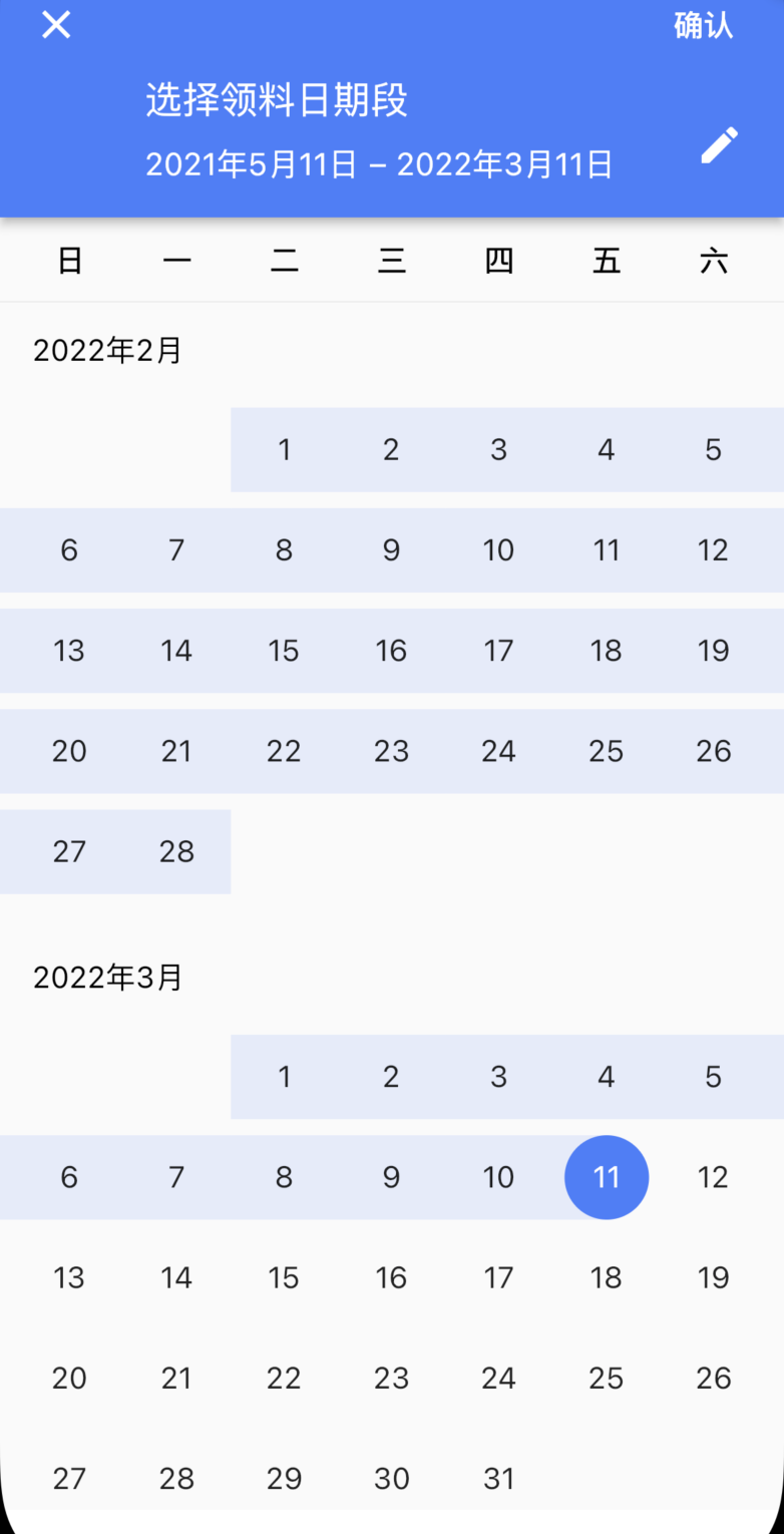
需求描述 Flutter默认提供的时间段选择组建调用如下:
1
2
3
4
5
6
7
8
9
10
11
DateTimeRange? pickedRange = await showDateRangePicker( context: context, initialDateRange: DateTimeRange( start: DateTime.now().subtract(Duration(days: 30)), end: DateTime.now()), helpText: "选择领料日期段", cancelText: '取消', saveText: '确认', firstDate: DateTime.now().subtract(Duration(days: 365)), lastDate: DateTime.now() );
修改过程 按照原生开发的思路,首先直接找构造属性,没有再通过获取实例动态修改,但是flutter的view是Widget,其呈现和和更新机制和原生不同,先按照一般思路往下操作
一般思路 直接在构造方法中查看是否有配置属性就可以了,通过属性修改即可,查看showDateRangePicker方法源码:
1
2
3
4
5
6
7
8
9
10
11
12
13
14
15
16
17
18
19
20
21
22
23
24
Future<DateTimeRange?> showDateRangePicker({ required BuildContext context, DateTimeRange? initialDateRange, required DateTime firstDate, required DateTime lastDate, DateTime? currentDate, DatePickerEntryMode initialEntryMode = DatePickerEntryMode.calendar, String? helpText, String? cancelText, String? confirmText, String? saveText, String? errorFormatText, String? errorInvalidText, String? errorInvalidRangeText, String? fieldStartHintText, String? fieldEndHintText, String? fieldStartLabelText, String? fieldEndLabelText, Locale? locale, bool useRootNavigator = true, RouteSettings? routeSettings, TextDirection? textDirection, TransitionBuilder? builder, }) async {...//省略
并没有helpText相关的style设置,也就是说并没有属性能够配置,看来该方法不可行
查看源码 当一般方法行不通的时候就需要一点点探究精神了,既然这个Widget的显示中有字体,就一定有字体相关的style属性,同理也一定是在哪里设置了颜色相关配置,那就简单了,直接源码看一下哪里赋值的不就知道了么
先说字体:1313-1336行
1
2
3
4
5
6
7
8
9
10
11
12
13
14
15
16
17
18
19
20
21
22
23
24
25
case DatePickerEntryMode.calendarOnly: contents = _CalendarRangePickerDialog( key: _calendarPickerKey, selectedStartDate: _selectedStart.value, selectedEndDate: _selectedEnd.value, firstDate: widget.firstDate, lastDate: widget.lastDate, currentDate: widget.currentDate, onStartDateChanged: _handleStartDateChanged, onEndDateChanged: _handleEndDateChanged, onConfirm: _hasSelectedDateRange ? _handleOk : null, onCancel: _handleCancel, entryModeButton: showEntryModeButton ? IconButton( //编辑按钮图标 icon: const Icon(Icons.edit), padding: EdgeInsets.zero, color: onPrimarySurface, tooltip: localizations.inputDateModeButtonLabel, onPressed: _handleEntryModeToggle, ) : null, confirmText: widget.saveText ?? localizations.saveButtonLabel, helpText: widget.helpText ?? localizations.dateRangePickerHelpText, );
源码这里IconButton就是我们的日期展示后面的编辑按钮,那么前面的部分就有设置字体大小的地方,前面是一个_CalendarRangePickerDialog,进入源码查看一下 1457-1475行
1
2
3
4
5
6
7
8
9
10
11
12
13
14
15
16
17
18
19
20
21
22
23
24
@override Widget build(BuildContext context) { final ThemeData theme = Theme.of(context); final ColorScheme colorScheme = theme.colorScheme; final MaterialLocalizations localizations = MaterialLocalizations.of(context); final Orientation orientation = MediaQuery.of(context).orientation; final TextTheme textTheme = theme.textTheme; final Color headerForeground = colorScheme.brightness == Brightness.light ? colorScheme.onPrimary : colorScheme.onSurface; final Color headerDisabledForeground = headerForeground.withOpacity(0.38); final String startDateText = _formatRangeStartDate(localizations, selectedStartDate, selectedEndDate); final String endDateText = _formatRangeEndDate(localizations, selectedStartDate, selectedEndDate, DateTime.now()); //这下面就是设置开始和结束的时间,那这个headlineStyle就是字体大小了 final TextStyle? headlineStyle = textTheme.headline5; final TextStyle? startDateStyle = headlineStyle?.apply( color: selectedStartDate != null ? headerForeground : headerDisabledForeground, ); final TextStyle? endDateStyle = headlineStyle?.apply( color: selectedEndDate != null ? headerForeground : headerDisabledForeground, ); final TextStyle saveButtonStyle = textTheme.button!.apply( color: onConfirm != null ? headerForeground : headerDisabledForeground, );
成功找到headline的style设置来源于textTheme.headline5,说明这些属性是通过Theme的属性设置的,那是不是给我们的日期选择dialog外面加一个Theme并配置相关属性就可以了呢?是的,就是这么简单,但还需要找到属性的对应关系,也就是说应该配置哪些属性。这里有两个问题 1.怎么包装这个dialog,2.找剩余需要配置的属性
1.怎么包装这个dialog 很显然要拿到这个dialog的widget才行,所以再次后去看showDateRangePicker的源码1007-1023行
1
2
3
4
5
6
7
8
9
10
11
12
13
14
15
16
17
18
if (locale != null) { dialog = Localizations.override( context: context, locale: locale, child: dialog, ); } return showDialog<DateTimeRange>( context: context, useRootNavigator: useRootNavigator, routeSettings: routeSettings, useSafeArea: false, builder: (BuildContext context) { //这里会判断是否有builder,如果有,则使用builder来封装dialog return builder == null ? dialog : builder(context, dialog); }, );
还记得showDateRangePicker的属性TransitionBuilder? builder吗?是的,可以通过设置builder来获取到该dialog,再包装一层Theme就解决了
1
2
3
4
5
6
7
8
9
10
11
12
13
14
15
16
17
18
19
20
DateTimeRange? pickedRange = await showDateRangePicker( context: context, initialDateRange: DateTimeRange( start: DateTime.now().subtract(Duration(days: 30)), end: DateTime.now()), helpText: "选择领料日期段", cancelText: '取消', saveText: '确认', firstDate: DateTime.now().subtract(Duration(days: 365)), lastDate: DateTime.now() builder: (context, child) => customDatePickTheme(context,child) ); customDatePickTheme(context, child) { ThemeData theme = Theme.of(context); return Theme( data: theme, child: Container( child: child,)); }
2.其他属性的查找 使用上面的方法查找属性在1506-1514行,找到helpText的字体大小由textTheme.overline设置
1
2
3
4
5
6
7
8
9
child: Column( crossAxisAlignment: CrossAxisAlignment.start, children: <Widget>[ Text( helpText, style: textTheme.overline!.apply( color: headerForeground, ), ),
查看_HighlightPainter类即选中的时间段颜色在_buildDayItem中2247-2254行
1
2
3
4
5
6
7
8
9
10
11
12
13
14
15
Widget _buildDayItem(BuildContext context, DateTime dayToBuild, int firstDayOffset, int daysInMonth) { final ThemeData theme = Theme.of(context); final ColorScheme colorScheme = theme.colorScheme; final TextTheme textTheme = theme.textTheme; final MaterialLocalizations localizations = MaterialLocalizations.of(context); final TextDirection textDirection = Directionality.of(context); //这里设置选中的颜色 final Color highlightColor = _highlightColor(context); final int day = dayToBuild.day; ...略 //可以看出选中颜色由Theme的colorScheme控制 Color _highlightColor(BuildContext context) { return Theme.of(context).colorScheme.primary.withOpacity(0.12); }
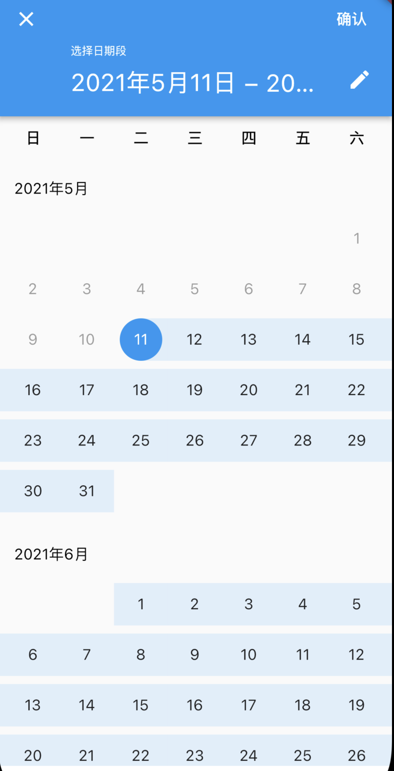
总结 阅读源码并不难,只要根据自己的需求抓主要线索就能很快定位到需要查找的地方,这比引入一个新控件节省更多的时间和学习成本,下次遇到其他修改需求也能更快的找到并修改,最后贴一下DateTimeRange的Theme配置和效果图
1
2
3
4
5
6
7
8
9
10
11
12
DateTimeRange? pickedRange = await showDateRangePicker( context: context, initialDateRange: DateTimeRange( start: DateTime.now().subtract(Duration(days: 30)), end: DateTime.now()), helpText: "选择日期段", cancelText: '取消', saveText: '确认', firstDate: DateTime.now().subtract(Duration(days: 365)), lastDate: DateTime.now() builder: (context, child) => customDatePickTheme(context,child) );
1
2
3
4
5
6
7
8
9
10
11
12
13
14
15
16
17
18
19
20
//日期选择的主题和字体大小设置 customDatePickTheme(context, child) { ThemeData theme = Theme.of(context); final TextTheme partialTheme = TextTheme( headline4: TextStyle(fontSize: ScreenUtil().setSp(30)), headline5: TextStyle(fontSize: ScreenUtil().setSp(30)), overline: TextStyle(fontSize: ScreenUtil().setSp(36))); theme = theme.copyWith( colorScheme: theme.colorScheme.copyWith(primary: AppBarColors.backgroundColor), textTheme: theme.textTheme.merge(partialTheme), appBarTheme: AppBarTheme( backgroundColor: AppBarColors.backgroundColor, )); return Theme( data: theme, child: Container( child: child, )); }